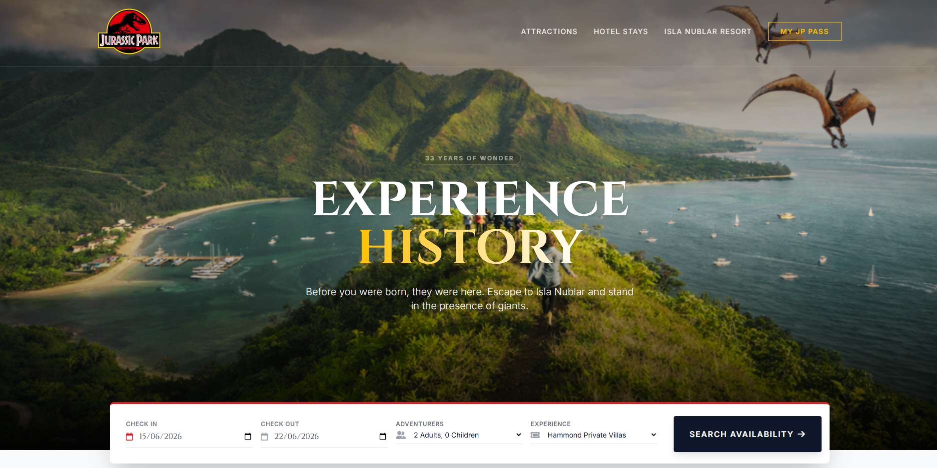
Jurassic Park was the first Movieverse site I built, and it set the tone for the whole project. The question was simple: what would Jurassic Park’s website look like if the park actually opened? Instead of a nostalgia site, I wanted to imagine Hammond’s original 1993 idea carried forward into the present day, having been a runaway success.
If Jurassic Park had failed, as in the movie the website would be obvious: emergency statements, lawsuits, containment language, maybe a shuttered corporate holding page. But if it succeeded, the design problem becomes way more complex. How do you make a private island full of genetically engineered dinosaurs feel safe enough to book? How do you sell something genuinely impossible using the same visual language as a luxury resort, a theme park and a family holiday site?
That was the important part for me. This was not Jurassic World, and it was not a version of Jurassic Park built after a disaster. It was the original park, thirty-three years later, still operating, still expanding, and now presenting itself as a world-class destination resort.
The easiest mistake would have been to make it look too much like Jurassic Park. This might sound odd, however, the website is set in 2026, some 33 years after the original Park opened. To make it convincing, I had to design (without ever showing) 3 decades of corporate branding evolution, Park expansion and marketing streamlining to present a version of the Park as it would be today. The branding lives within the established Universe of the movie, but updated for a modern website experience.

So how does an island full of roving dinosaurs and potentially deadly encounters market itself as a luxury resort holiday? That became the central idea of the Isla Nublar site: the danger is never denied, but it is constantly managed by design. The site does not scream “dinosaurs”. It behaves like a high-end destination resort that happens to have dinosaurs. That distinction matters, because a real Jurassic Park would be selling the illusion of danger inside a system that feels completely under control.
The dinosaurs are the reason the place exists, but the page still has to do the job of a travel website. It has to talk about accommodation, dates, activities, food, access, families, safety and the practical business of staying there.
A lot of the work is done by ordinary website furniture. The booking panel in particular is your first stop as you scroll past the hero. None of that is exciting by itself, but my hope was to frame the site’s story around functional components to make it feel familiar as a travel booking site.
The footer is another example. Most people barely look at footers, but they are useful for making a fictional organisation feel real. Privacy Policy, Terms of Service, Accessibility, Safety Protocols. Placing “Safety Protocols” next to the usual legal links makes it feel feel normal rather than dramatic.
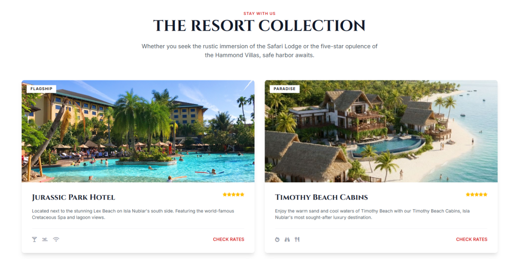
The resort names were another way to build the alternate timeline without over-explaining it. Lex Beach, Timothy Beach Cabins, Hammond Private Villas and Mount Williams Lodge all needed to work as plausible resort names first. You do not need to understand the references for the page to make sense. But if you do, there is another layer: Hammond’s grandchildren have lent their names to beaches and cabins.
Coupon Day came from the same place. In the film, Gennaro throws it out as a cynical solution to the problem of ordinary people not being able to afford the park. It is not generosity; it is a token concession. So in this version of the park, Coupon Day has become an annual event. That felt exactly like something a massive corporate entity would do, not realising how tone deaf it all is. Hammond’s big democratic dream gets processed through decades of corporate reality and finance department veto and comes back as a limited promotional campaign with terms and conditions.
The blog section let me do some quieter world-building too. A post about Chilean sea bass is a direct reference to the visitor centre meal in the film, but on the site it is treated as content marketing. “Spared no expense” becomes a tagline rather than a character trait.
I also had to decide how much later Jurassic Park and Jurassic World material to include, if at all. If the premise is “the original park worked”, there is an argument for keeping everything strictly 1993: visitor centre, Ford Explorers, fences, paddocks, classic tour route. But that made the park feel oddly frozen. No major destination resort stays the same for three decades. Theme parks expand because they have to. New rides, new capacity, new guest experiences, new reasons to come back.
That is why things like Gyrosphere Valley and Mosasaurus Lagoon make sense in this version. I didn’t treat them as reboot elements. I treated them as later investments in a successful park. The gyrosphere becomes the modern upgrade to the original vehicle tour. The Mosasaurus Lagoon becomes the kind of large-scale expansion a company would build once it had the money, confidence and audience demand. In this timeline, InGen never has to rebrand as Jurassic World after a disaster. Jurassic Park simply keeps growing.
The attraction copy had to sit in a strange middle ground. It could not make the dinosaurs feel harmless, because then the site loses the whole point. But it also could not make them feel genuinely dangerous, because then the holiday premise falls apart. So the language turns danger into scheduling. Tyrannosaurus Kingdom has viewing galleries and scheduled feedings. A T-Rex feeding is obviously terrifying, but once it is scheduled, ticketed and viewed from a gallery, it becomes part of the day plan. That felt very theme park to me. The wild thing becomes managed, timed and repeatable, as if it were a parade float instead of an enormous carnivore.
The softer attractions balance that out. Kayaking past grazing Stegosaurus, rolling through Gyrosphere Valley, walking the Triceratops Trail, meeting baby dinosaurs at the Every Little Creature Petting Zoo. Those are there because Jurassic Park was never just horror. The first major emotional hit of the original film is wonder. The Brachiosaurus scene is awe-inspiring, not scary. A successful version of the park would sell that side heavily. It would want guests to think of the dinosaurs as animals they can encounter, not monsters waiting to escape.
The Gallimimus Valley copy uses “They’re flocking this way” as a small example of how I wanted references to work. In the film, it is a line from a moment of panic. On the website, it becomes a light promotional hook for a seasonal plains tour. I liked that because it takes something frightening from the original context and shows how differently it would read inside a successful version of the park.
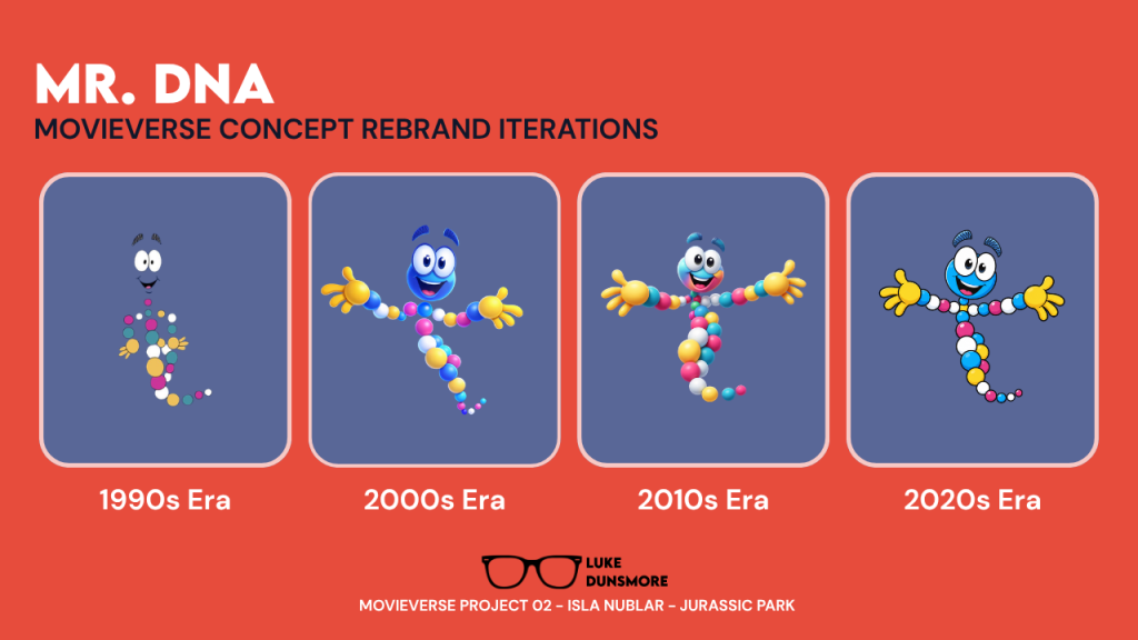
Mr. DNA was another piece that needed to feel evolved rather than simply referenced. In the film, he is educational. He explains the science in that very 90s theme park pre-show way. But if Jurassic Park had remained open, he would not stay untouched. He would be redesigned, simplified for screens, used in the app, put on children’s menus and dragged into commercial service. So on the site he becomes part of the family dining plan. That is intentionally a bit grim. A character created to explain genetic science ends up selling prepaid meals. But again, that is what long-running attractions do. They do not preserve mascots in amber. They monetise them.
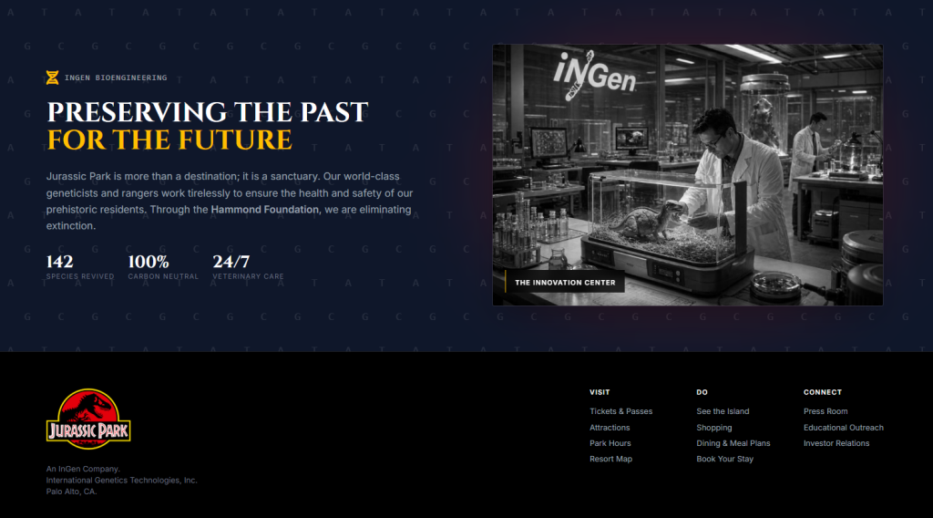
Ingen, John Hammond’s company which built Jurassic Park, is updated for 2026 as well. Ingen’s ethically dicey genetic experimentation has been repackaged as sustainability. The company is no longer “playing God”; it is “preserving the past for the future”. It talks about species revived, carbon neutrality and all the other notes it needs to hit for a modern company to protect itself.
Looking back, Isla Nublar taught me that these sites work best when they are not trying to recreate the film directly. They work when the fictional world is treated as real and then forced through the biggest question businesses face online: What would a customer need to believe before entering their card details?
For Isla Nublar, the answer is trust. The site is not trying to prove that dinosaurs exist. In this timeline, that is old news. It is trying to prove that dinosaurs can be managed. That was really interesting to design, because it puts the tension in the interface rather than the imagery. The whole page is basically saying: yes, this is insane, but look how organised we are.
You can check out Isla Nublar here. The site is part of the larger Movieverse project, a part of my freelance web design & development portfolio.