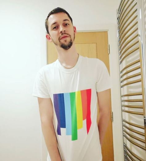
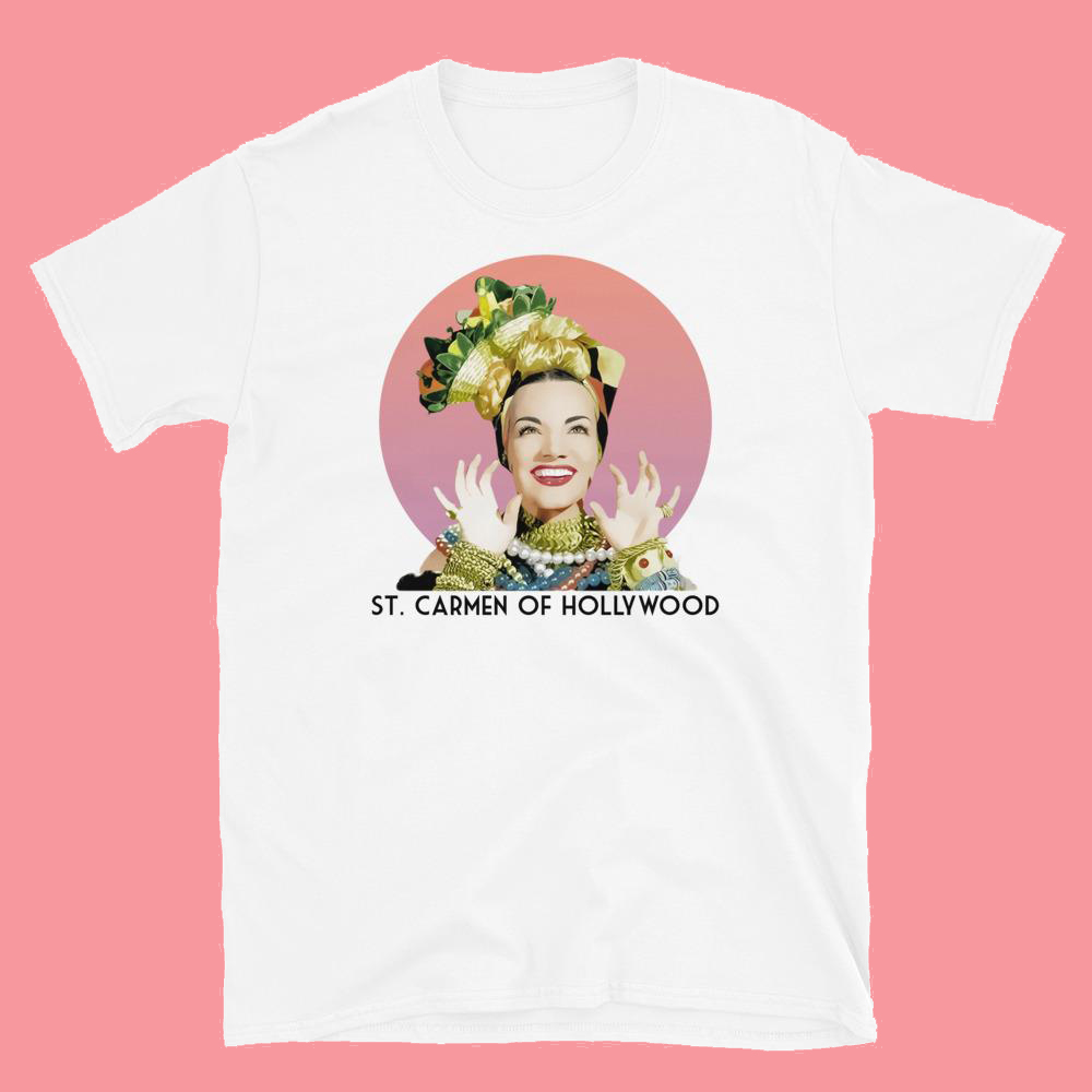
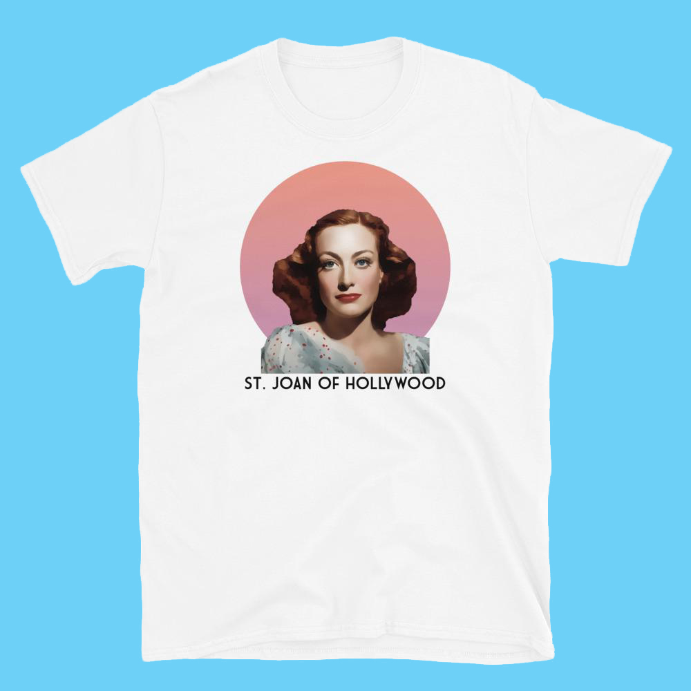
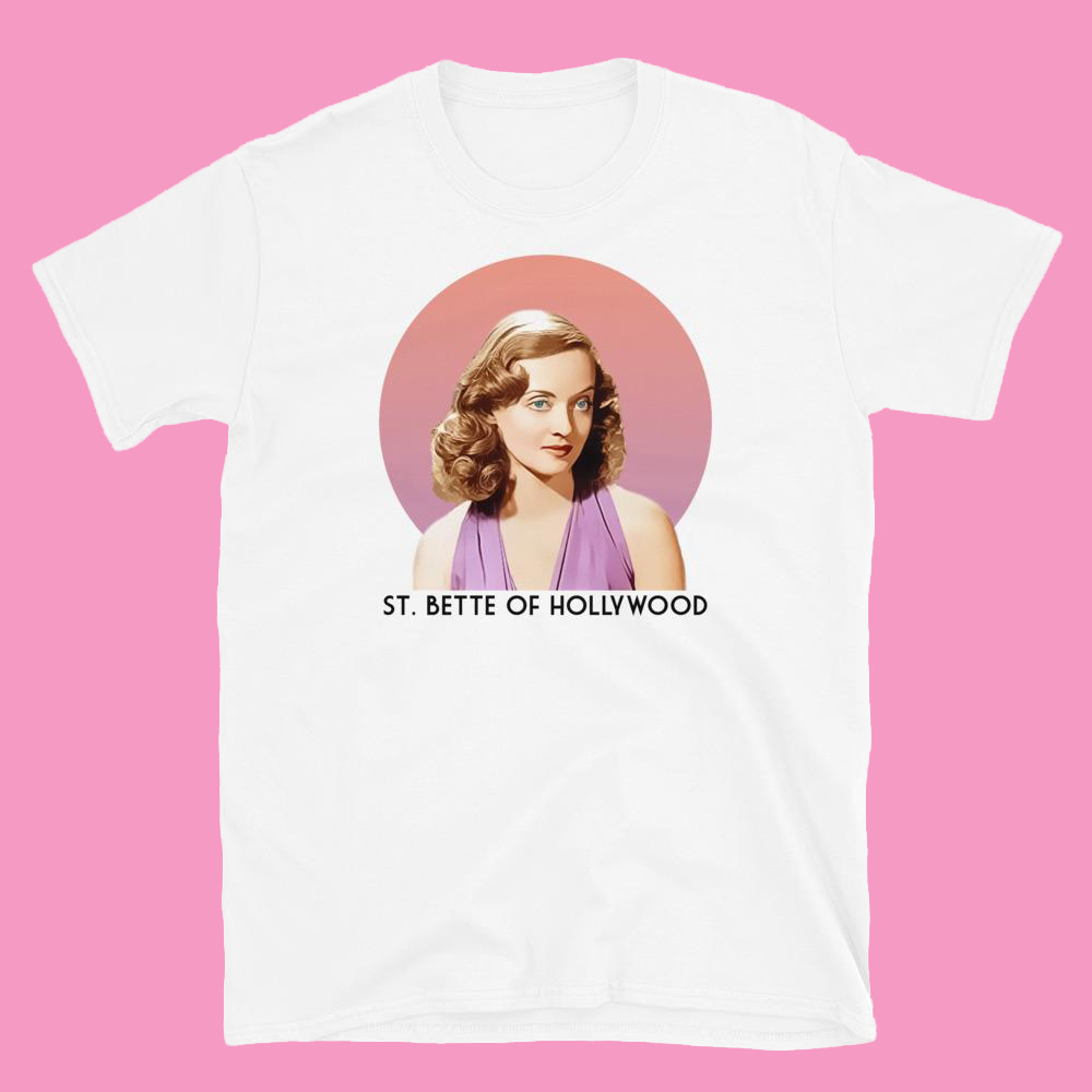
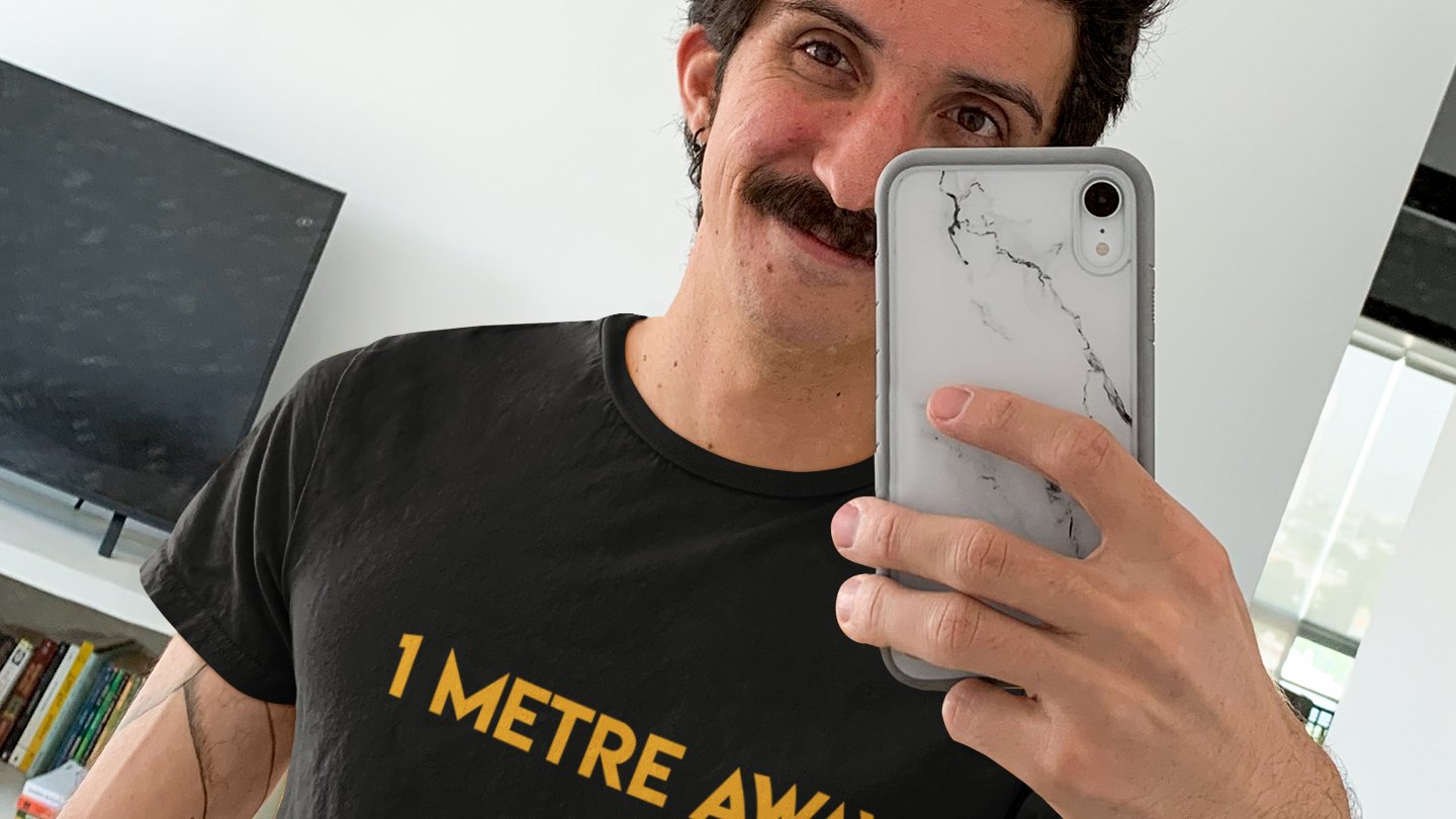
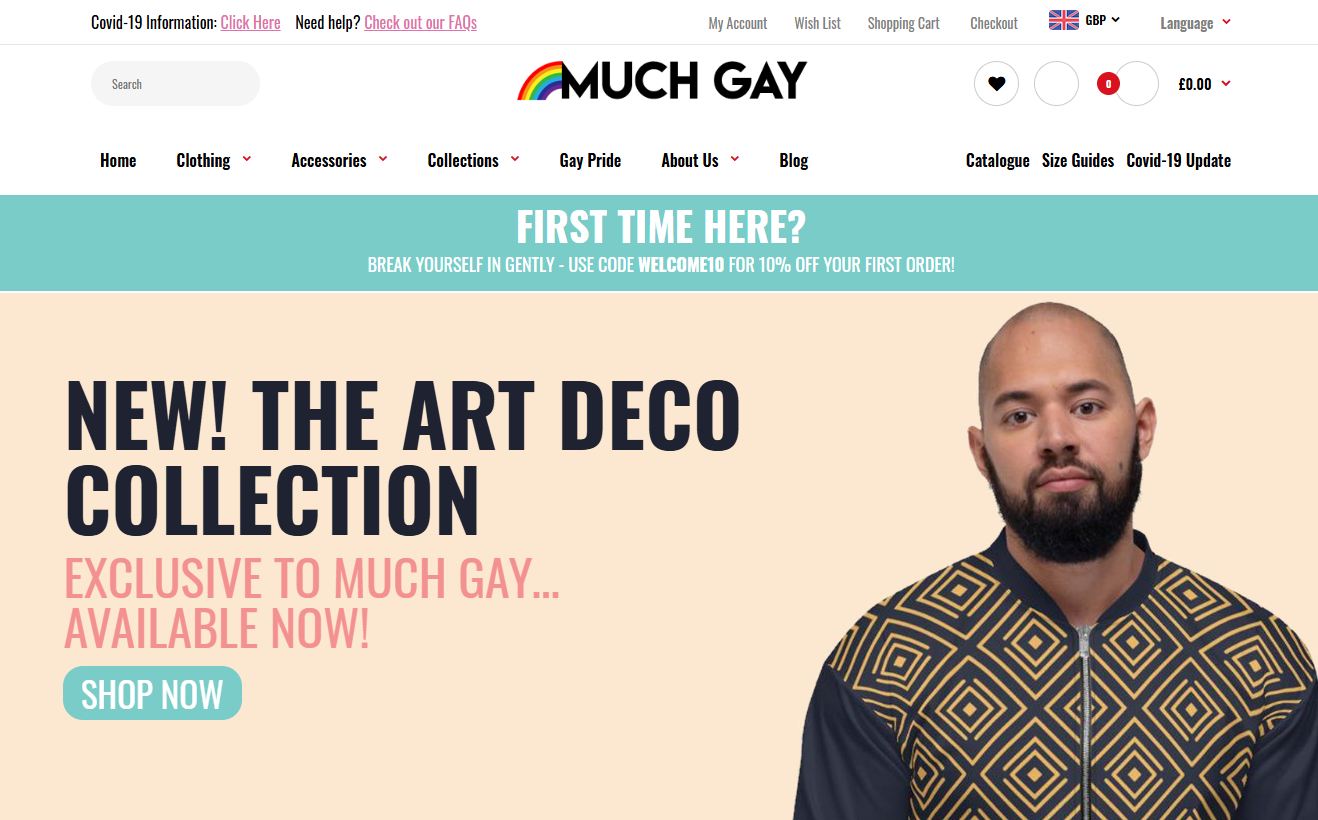
Much Gay was as much an exploration of product design as it was building a scalable brand. Back in 2020, I was knee-deep in figuring out how far I could push a simple idea into a fully formed product line. The project started as a playful side-experiment — bold colours, irreverent art direction, unapologetically gay energy — but quickly became a crash course in designing merch that people actually wanted to wear. Every illustration, mock-up, and print test became a tiny lesson in how to create something that felt polished, joyful, and unmistakably “Much Gay”.
The shirts you see here weren’t just graphics slapped on cotton; they were small brand worlds. Each design had its own character, palette, and personality, and the challenge was always how to keep the collection cohesive without losing the eccentric charm. (You may even notice a certain font I’ve been using in projects ever since!) It forced me to think about consistency, repeatable workflows, supplier constraints, and the practical realities of producing at scale — all while keeping the fun intact.
That mix of creativity and systems thinking ended up being the real engine of the project. It looked like a fashion line on the surface, but behind it was early training in branding discipline, production workflows, and how to shape a concept into something people recognise at a glance.

