I put these hotel landing pages together as a spec project to flex some design muscles and experiment with how different UI styles can completely change the “vibe” of a brand. Since these aren’t real hotels, I had the freedom to ignore strict corporate guidelines and focus entirely on creating immersive, character-driven experiences. Manchester provided the perfect backdrop, allowing me to contrast two very different sides of the city’s personality while testing out different layouts and interaction patterns.
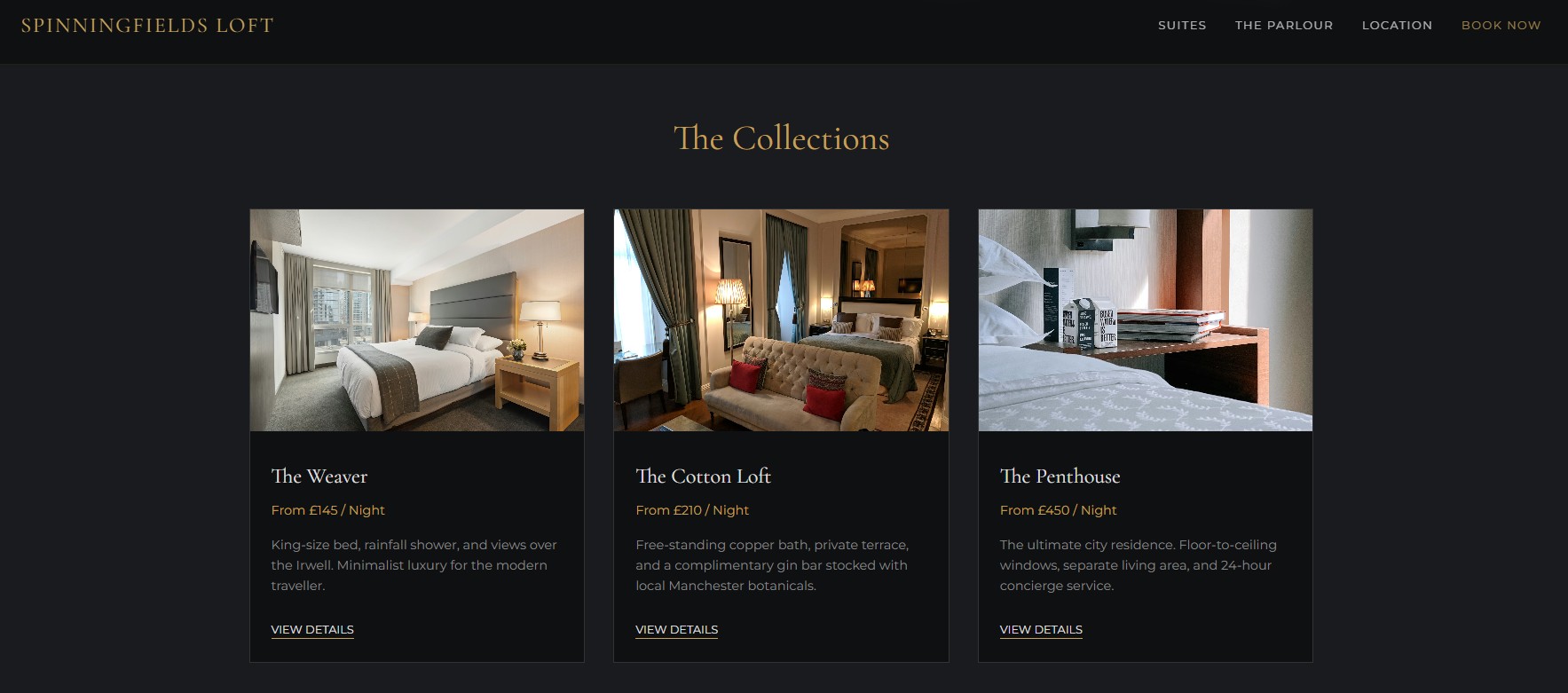
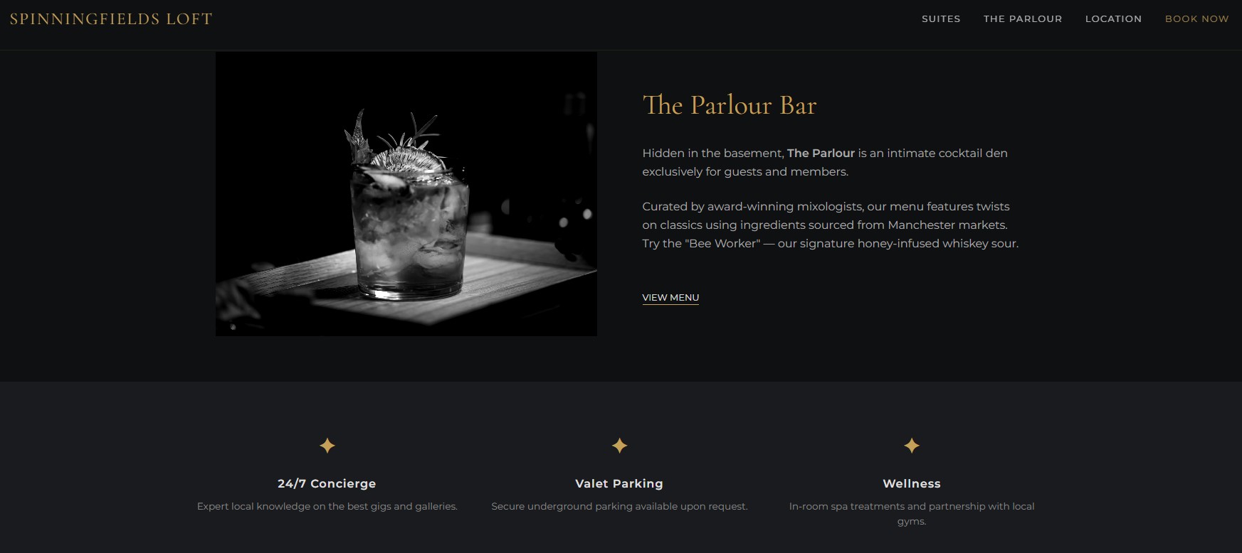
For The Spinningfields Loft (which you can check out here), I went for a polished, high-end aesthetic that mirrors the glass-and-steel feel of the city’s financial district. I wanted the site to feel like a quiet sanctuary—minimalist, sharp, and very much focused on “quiet luxury.” I used plenty of space and clean typography to ensure the interface felt as premium as the penthouse itself.
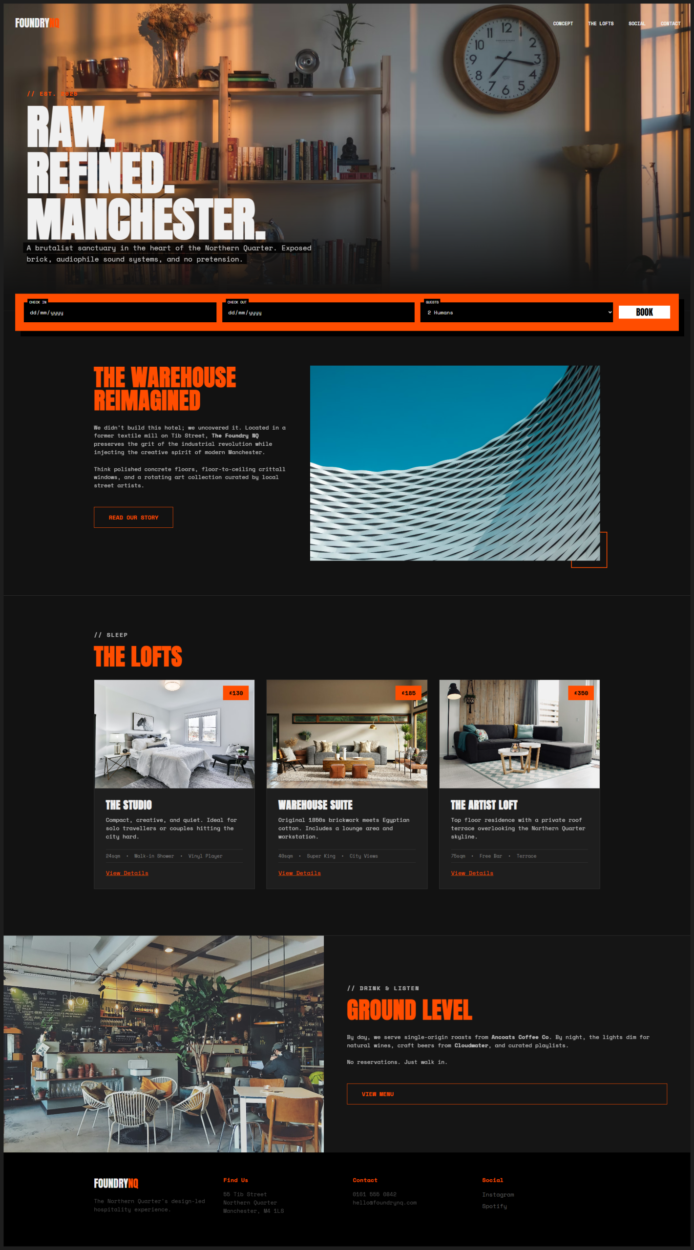
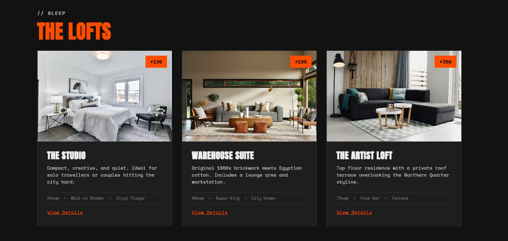
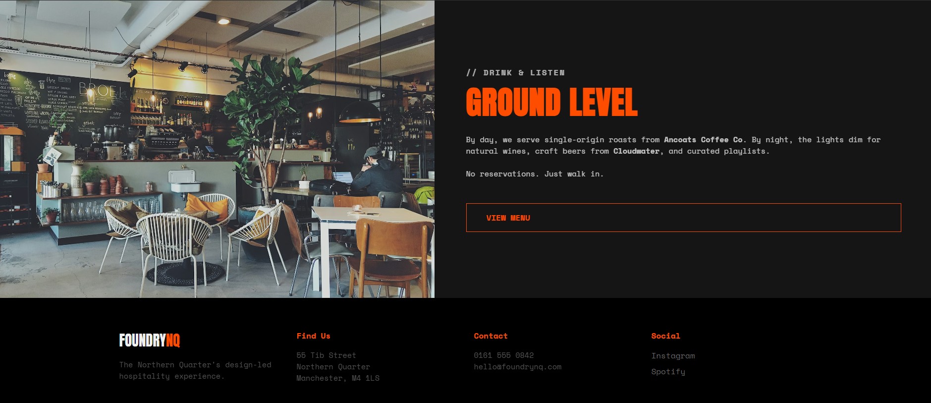
The Foundry NQ was a totally different beast. I wanted to lean into the red-brick, industrial heritage of the Northern Quarter, so I used warmer textures and a more grounded colour palette. This one was all about capturing that creative, warehouse-conversion energy that makes the NQ so distinct. I focused on making the design feel tactile and authentic to the neighbourhood’s roots, balancing a slightly grittier look with a modern, user-friendly booking flow that feels right for a traveller looking for an independent Manchester experience.